- Home
- Production
- Isoquant

What is an
Isoquant Curve in Economics?
An Isoquant is a concept in microeconomics that relates to a given amount of output produced by a firm, and its purpose is to illustrate how different amounts of capital and labor can be combined to produce that output.
Right away we should note that we are referring here to the long-run, because in short-run microeconomic models we assume that a firm’s capital stock is fixed, and only labor is variable. When we allow for the passage of time, all inputs in the production process become variable, meaning that they can be increased or decreased as desired.
There is no specific isoquant formula that universally applies and, when economists refer to an isoquant formula, they usually adopt a particular production function (click the link for details) for their purposes. In the analysis below I will keep matters simple, and assume that the productivity of a unit of capital and a unit of labor is equal, but that their combined productivity is higher.
Use of a simple chart and graph will make this easy to understand.
Isoquant
Graph & Chart

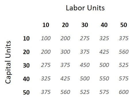
The isoquant chart above shows output amounts that can be produced with different combinations of capital and labor, ranging from 10-50 capital units and 10-50 labor units. One unit of capital combined with one unit of labor yields an output of 100 products (let’s call them widgets).
Fifty units of capital and ten units of labor yields the same as ten units of capital and fifty units of labor i.e., 375 widgets. However, the synergistic efficiency of using a more balanced combination of inputs, say thirty units of each, yields 450 widgets.
If the cost of a unit of capital is equal to a unit of labor, then a profit maximizing firm would prefer to use an equal amount of capital and labor. Of course, in reality these costs may differ, so we cannot conclude here which combination is best.
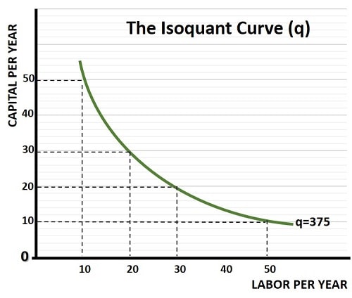
Notice how, in the chart above, there are only four different combinations of inputs that yield 375 widgets. An isoquant curve plots all combinations that yield a given output, as we see in the graph below.

Why are
Isoquants downward sloping?
Isoquants are downward sloping because of the law of diminishing returns. This law states that, beyond some point, adding more and more of one input to the production process will still increase output, but by a smaller and smaller amount.
Referring back to the isoquant chart above, holding capital units fixed at 10, we see that 10 units of labor yields 100 widgets. Adding a further 10 units of labor doubles output to 200 widgets. Adding a further 10 units of labor increases output, but by a smaller amount, leading to 275 widgets. Each increment of labor units, while holding capital fixed, yields smaller and smaller increases in output.
It is for this reason that most isoquants are downward sloping, and bowed inwards. In technical jargon we say that the isoquant curve is convex to the origin. For more details on this, see my article about the marginal rate of technical substitution (MRTS).
In my article about the production function, I set out two special cases whereby isoquants are not curved. A linear isoquant line results in the rare case of inputs being perfect substitutes for each other. At the other extreme, when inputs are perfect complements, the resulting isoquant will be L-shaped. Click the link for details.
The Isoquant
Map

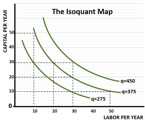
Adding multiple isoquant curves to a single graph gives us the Isoquant Map. From this we can start to get an illustrative idea of the production function, which is usually presented as an equation. Higher isoquant curves are associated with higher quantities of output.
We’ve already seen the isoquant curve for 375 widgets, but referring back to the chart at the top of the page, you’ll see that an output of 275 widgets can be produced with either 10 units of labor and 30 units of capital, or vice versa with 30 units of labor and 10 units of capital. Similarly, the chart shows that 450 widgets can be produced with 30 units of labor and 30 units of capital.
Both of these isoquant curves are added to the graph above, giving us an isoquant map. The same concept applies to indifference curves and consumer preferences, but here the isoquant map reflects a kind of producer preference. Of course, to arrive at producers’ preferred inputs into the production process, we need to take the costs of those inputs into account.
Isoquant and
Isocost Analysis
The value of an isoquant curve is best demonstrated when used in conjunction with an Isocost Line because it gives us a cost minimization point for any given quantity of output. See my article about Cost Minimization for more details.
Conclusion
Isoquant curves and isoquant maps are essential tools in microeconomic analysis, specifically in understanding a firm's production process and resource allocation optimization.
The slope of an isoquant curve i.e., the MRTS, indicates the rate at which one input can be substituted for another while maintaining constant output. Firms use this information to make decisions regarding input substitution, aiming to optimize production efficiency and minimize costs.
Isoquant maps expand on the concept of isoquant curves by providing a comprehensive overview of production possibilities across different output levels. These maps assist firms in assessing economies of scale, as the proximity of isoquants at different scales indicates the potential for efficiency gains.
Related Pages: