- Home
- Market Failure
- Excess Supply

Excess Supply Graph and Examples
Excess supply of a good or service is a situation that occurs when, for some reason, the price is too high to clear the market. In most situations this will result in a buildup of unsold goods, which will cause firms to cut production and lower their prices, but in some cases prices may be fixed.
The classic example of a price that may be fixed above the market clearing rate is that of the labor market and a minimum wage, which I will analyse below.
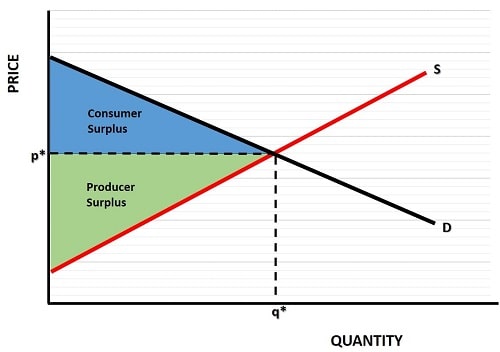
First of all, lets look again at the standard market equilibrium graph depicting consumer and producer surplus as presented on my page about excess demand.

Consumer surplus occurs for all output above the market clearing price of p and below the demand curve, i.e. the blue area as illustrated.
Producer surplus occurs for all output below the market clearing price, but above the supply curve, i.e. the pink area.
The most efficient price and output combination for society is given by the market clearing price p with an output quantity of q. Any other combination will lead to some surplus value being lost i.e. a 'deadweight loss'. This is clearly the case with any market that experiences excess supply, as I will now explain.
Excess Supply Graph in the Labor Market
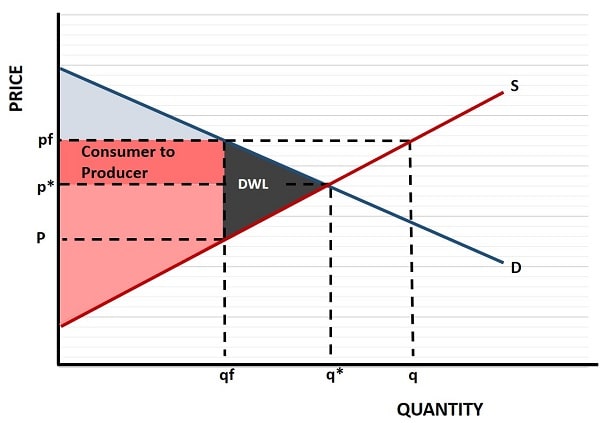
In the excess supply graph below we can illustrate what happens in a labor market where a minimum wage has been set that is above the market clearing wage. The price in the labor market refers to the price that must be paid to workers i.e. the wage. The quantity is the number of people employed in that labor market.
If there was no minimum wage and the market was allowed to clear then the wage rate would be equal to p* and the quantity of people working would be q*.
The supply curve in this market relates to potential workers, because it is these people who supply their labor. For that reason, we can associate producer surplus with workers in the labor market. The consumers in this example are the employers, because they are the buyers of the services provided by the workers.

As we can see in the excess supply graph, when a minimum wage is fixed at a higher rate than the market clearing rate, we get a situation of unused labor. At a wage of pf, those people who find work are better off, as illustrated by the gray box, which is a transfer of surplus from employers (consumers) to workers because of the higher wage.
However, the quantity of workers demanded falls due to the extra cost, and this is illustrated by the lower quantity of qf compared to q*. Potential workers, on the other hand, will increase because more people are attracted to the labor market by the prospect of higher wages, so the quantity of workers supplied rises to q.
Excess supply in the labor market is equal to q - qf, and this shows the quantity of unemployed workers i.e. the number of potential workers who want to work but cannot find a job.
Also note that, with qf less than q*, there is a deadweight loss (DWL) to workers who were previously employed at the lower market clearing rate, but who are now effectively priced out of the market and made redundant.
DWL, in the graph, represents lost surplus for both workers and employers. Employers used to make a surplus from the larger number of workers it employed at the old market clearing price of p*, but now they have to pay the higher wage of pf.
Worst Examples of Excess Supply
In the previous example of excess supply in the labor market, the deadweight losses to society were significant, but imagine how much worse it would have been if the unemployed workers had actually been given all the jobs that they wanted, but had not produced anything of value over and above that which they produced with qf workers.
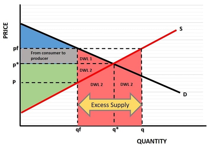
In this situation the deadweight losses would have been far higher, and the DWL area illustrated below would represent the extra losses.

Believe it or not, there are plenty of markets where this can happen, and does happen, when the government imposes a price that is higher then the market clearing rate.
Imagine, for example, that farmers are told that the price for wheat after the next harvest will be fixed at pf, as in the graph above, and that all of their output will be purchased.
The new higher fixed price for wheat encourages these farmers to produce a larger crop in order to maximize profits. Therefore, buoyed by the higher price, total supply in the wheat market will increase all the way to q. Unfortunately for society, consumers do not wish to purchase this much wheat at such an artificially high price, and their demand falls to qf.
Society will now have all the deadweight loss illustrated in the graph, and farmers will have mountains of unsold wheat. Since the government promised farmers that all of their output would be purchased, the government must take up the slack and purchase all the unsold output - output that will go to waste!.
This does create a lot more surplus for farmers, as can be seen by the combined pink areas in the graph, but consumers have less surplus, and there is a very large deadweight loss to society as a whole.
Whilst this might sound like an abstraction from reality, it is actually common practice for many governments to pursue this kind of insane policy. The losses accrue to consumers and taxpayers, because they are forced to pay higher prices, and subsidies to the farmers for all the excess supply. For evidence of this, check out the link below to the EU Butter Mountain.
Sources:
Related Pages:
About the Author
Steve Bain is an economics writer and analyst with a BSc in Economics and experience in regional economic development for UK local government agencies. He explains economic theory and policy through clear, accessible writing informed by both academic training and real-world work.
Read Steve’s full bio
Recent Articles
-
Bank Reserves, Asset Inflation, and the Risk of Future Price Inflation
Dec 19, 25 04:16 AM
Learn what bank reserves are, how they affect asset prices, and why future reserve creation could lead to inflation through commodities and currencies. -
Credit Creation Theory; How Money Is Actually Created
Dec 16, 25 03:07 PM
Explore how modern banks create money through credit creation, why the money multiplier fails, and the role of central banks and reserves. -
U.S. Industrial Policy & The Unfortunate Sacrifice that Must be Made
Dec 12, 25 03:03 AM
U.S. Industrial Policy now demands a costly tradeoff, forcing America to rebuild its industry while sacrificing bond values, pensions, and the cost of living. -
The Global Currency Reset and the End of Monetary Illusion
Dec 07, 25 03:48 AM
The global currency reset is coming. Learn why debt, inflation, and history’s warnings point to a looming transformation of the world’s financial system. -
Energy Economics and the Slow Unraveling of the Modern West
Dec 06, 25 05:18 AM
Energy economics is reshaping global power as the West faces decline. Explore how energy, geopolitics, and resource realities drive the unfolding crisis.