- Home
- Market Failure
- Edgeworth Box

The Edgeworth Box Diagram Explained
The Edgeworth box is a graphical tool used in microeconomics to analyze the distribution of goods or resources between two agents in an economy. It helps in understanding how these agents can exchange goods or resources with each other to reach a more efficient allocation, given their preferences and initial endowments.
The model here is based on an adaptation of the more commonly understood model on indifference curves. For a refresher on that model, have a look at my main article:
In this article, I'll explain how Edgeworth Box diagram can be used to illustrate how economic agents can achieve efficiency gains via trading with each other. Given the limitations of two-dimensional graphs it is not possible to illustrate on a graph how this would work for more than two individuals, but the points made are directly applicable to larger populations
Key components of the Edgeworth box
The Edgeworth box illustrates a simplified economy with only two individuals (two producers or two consumers) and two goods or resources. For simplicity, I'll proceed with an example of two consumers who can exchange two goods, cheese and biscuits, with each other.
Each consumer (John and Jane) has their own unique preferences over these two goods in terms of the relative amounts of them that they like to consume. These preferences are illustrated via their respective indifference curves.

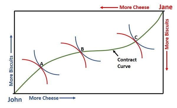
The box’s dimensions represent the total quantity of cheese and biscuits available in the economy. The horizontal axis shows the quantity of cheese, and the vertical axis shows the quantity of biscuits.
Each consumer starts with a specific allocation or endowment of the two goods, represented as a point in the box.
Each agent’s preferences are represented by indifference curves, which show combinations of cheese and biscuits that provide the same level of satisfaction (or utility). Higher indifference curves represent higher utility levels.
Pareto Efficiency
The Edgeworth box helps identify Pareto efficient allocations, where it’s impossible to make one consumer better off without making the other worse off.
These points lie on the contract curve, which runs between the two consumers’ indifference curves where their marginal rates of substitution (MRS) are equal.
For more details on this, see my main article:
How the Edgeworth Box Works
The Edgeworth box diagram above is formed by plotting the total amount of cheese on the horizontal axis and the total amount of biscuits on the vertical axis. John's origin is placed at the lower left, while Jane's origin is at the upper right, effectively flipping her indifference curve.
By analyzing the indifference curves of both consumers, economists can see how they might benefit from trading goods with each other.
The contract curve inside the box shows the set of efficient allocations that maximize the welfare of both agents, it occurs at the points where John's indifference curve just touches Jane's indifference curve.
The Edgeworth box is commonly used to illustrate the concept of gains from trade, market equilibria, and welfare economics, as it visualizes how two individuals can potentially reach mutually beneficial agreements by trading goods until they reach a Pareto efficient allocation.
For more explanation of how the trading process between John and Jane will naturally lead to these efficient allocations, with tangential indifference curves as illustrated in the Edgeworth Box diagram above, have a look at my article about Allocative Efficiency.
Related Pages:
- Pareto Efficiency
- Allocative Efficiency
- Productive Efficiency
- Dynamic Efficiency
- Economic Efficiency
- Market Failure
About the Author
Steve Bain is an economics writer and analyst with a BSc in Economics and experience in regional economic development for UK local government agencies. He explains economic theory and policy through clear, accessible writing informed by both academic training and real-world work.
Read Steve’s full bio
Recent Articles
-
Bank Reserves, Asset Inflation, and the Risk of Future Price Inflation
Dec 19, 25 04:16 AM
Learn what bank reserves are, how they affect asset prices, and why future reserve creation could lead to inflation through commodities and currencies. -
Credit Creation Theory; How Money Is Actually Created
Dec 16, 25 03:07 PM
Explore how modern banks create money through credit creation, why the money multiplier fails, and the role of central banks and reserves. -
U.S. Industrial Policy & The Unfortunate Sacrifice that Must be Made
Dec 12, 25 03:03 AM
U.S. Industrial Policy now demands a costly tradeoff, forcing America to rebuild its industry while sacrificing bond values, pensions, and the cost of living. -
The Global Currency Reset and the End of Monetary Illusion
Dec 07, 25 03:48 AM
The global currency reset is coming. Learn why debt, inflation, and history’s warnings point to a looming transformation of the world’s financial system. -
Energy Economics and the Slow Unraveling of the Modern West
Dec 06, 25 05:18 AM
Energy economics is reshaping global power as the West faces decline. Explore how energy, geopolitics, and resource realities drive the unfolding crisis.